Creating a Button
Buttons are an essential tool in layout design. They combine function with graphic elements. In addition, buttons are so well established that everyone recognizes them immediately.
Buttons in mos. are created by combining multiple layers and actions. The best practice for this is to use container layers. Within a container, buttons usually consist of a color and a text layer with one or more actions attached to the container. The color layer is generally used to highlight the button visually, while the text layer labels the button in question. Combining the color and text layer in a single container layer has the advantage of managing all constraints via the container and having a central layer to which actions can be attached. Buttons are usually styled using classes so that their appearance can be adjusted globally.
You can skip straight to the copyable code of this tutorial or follow the step by step instructions.
The following mos. components are used in this tutorial. If needed, you can refer to the corresponding wiki pages:
Step by step
Following these instructions you will be able to create buttons for your app.
{
  "type": "container",
  "name": "button"
}
- Create a
containerlayer.
{
  "name": ".buttonContainer",
  "content": {
    "borderColor": "#f3f3f3",
    "borderWidth": "1pt",
    "borderRadius": "20pt",
    "constraints": [
      {
        "type": "pos",
        "anchor": "c",
        "x": "50%",
        "y": "40%"
      },
      {
        "type": "size",
        "width": "200pt",
        "height": "70pt"
      }
    ]
  }
}
- Create a new file
buttonContainer.jsonin the/layer_styledirectory. - Create the class
buttonContainer. - Set the
borderandconstraintsin thecontentobject according to how you want the button to look like.
{
  "type": "container",
  "name": "button",
  "classes":[
    "buttonContainer"
  ]
}
- Style the
containerlayer using thebuttonContainerclass.

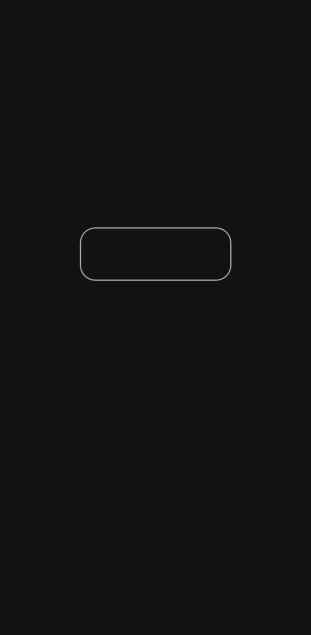
The button after setting a border and constraints for the container layer.
{
  "type": "container",
  "name": "button",
  "classes":[
    "buttonContainer"
  ],
  "children": [

  ]
}
- Add a
childrenarray to the container layer.
{
  "name": ".buttonColor",
  "content": {
    "value": "#34a7c9"
  }
}
- Create a new file
buttonColor.jsonin the/layer_styledirectory. - Create the class
buttonColor. - Set the
valuein thecontentobject to the hex color, that the button should have.
{
  "type": "container",
  "name": "button",
  "classes":[
    "buttonContainer"
  ],
  "children": [
    {
      "type": "color",
      "classes": [
        "buttonColor",
        "fullSize"
      ]
    }
  ]
}
- Add a
colorlayer to the children array as an object. - Style the
colorlayer using thebuttonColorclass. - Give the
colorlayer the classfullSize, as the container defines the dimensions in which it is drawn.

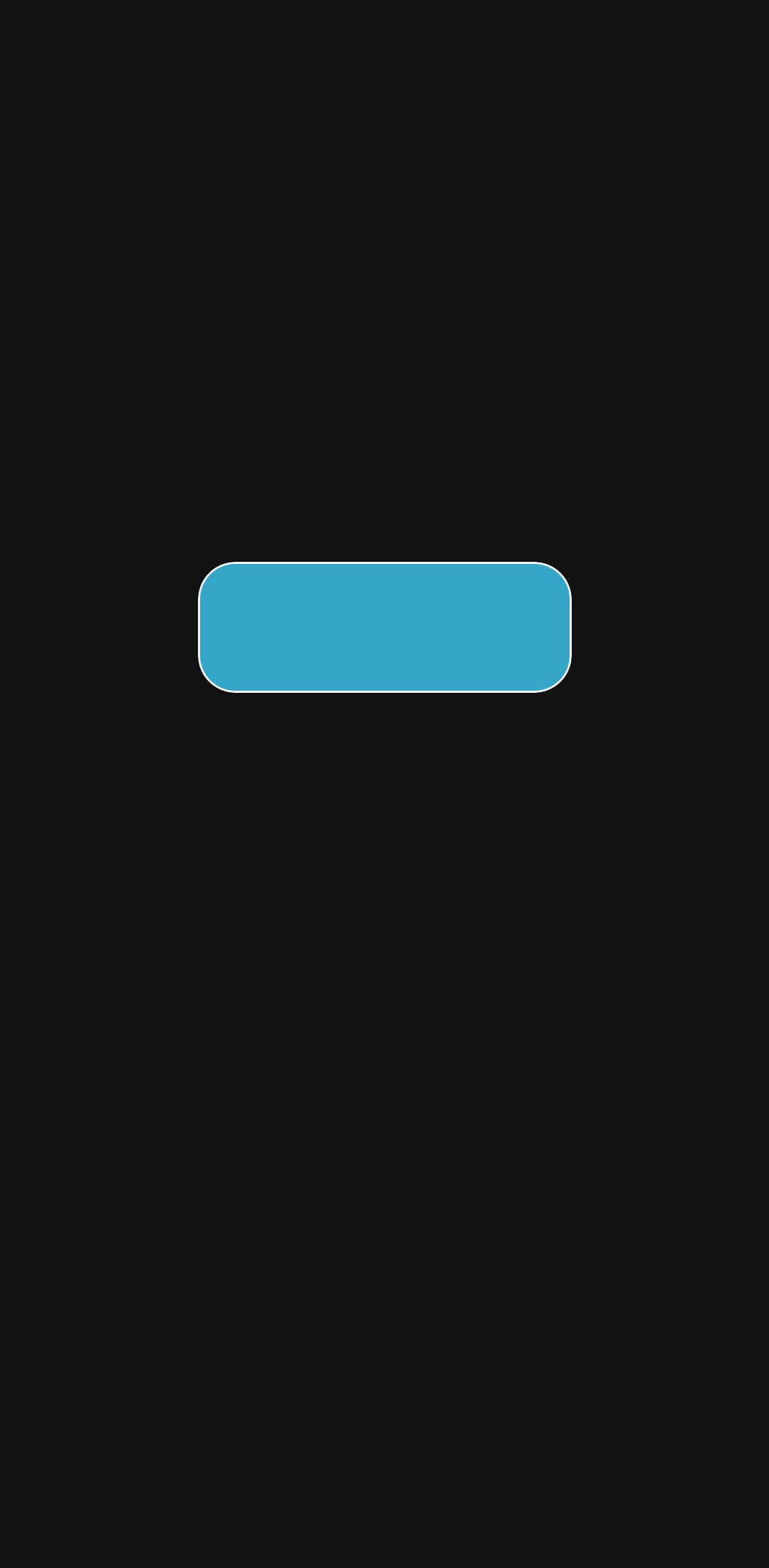
The button after adding the color layer to the container layer.
{
  "name": ".buttonText",
  "content": {
    "scaleType": "alignCenter"
  }
}
- Create a new file
buttonText.jsonin the/layer_styledirectory. - Create the class
buttonText. - Set the
scaleTypetoalignCenterin thecontentobject, which centers the text both horizontally and vertically.
{
  "name": "default",
  "content": {
    "buttonText": "Press me.",
    "messageTitle": "Congratulations!",
    "messageText": "Your button is working."
  }
}
- Add three key:value pairs to the
contentobject, which contain texts for later use.
{
  "type": "container",
  "name": "button",
  "classes":[
    "buttonContainer"
  ],
  "children": [
    {
      "type": "color",
      "classes": [
        "buttonColor",
        "fullSize"
      ]
    },
    {
      "type": "text",
      "value": "$lang(buttonText)$",
      "classes": [
        "buttonText",
        "fullSize"
      ]
    }
  ]
}
- Add a
textlayer to the children array as another object. - Set the
valueof thetextlayer to the text you want written on the button. - Give the
textlayer the classbuttonTextto have the text centered. - Give the
textlayer the classfullSize, as the container defines the dimensions in which it is drawn.

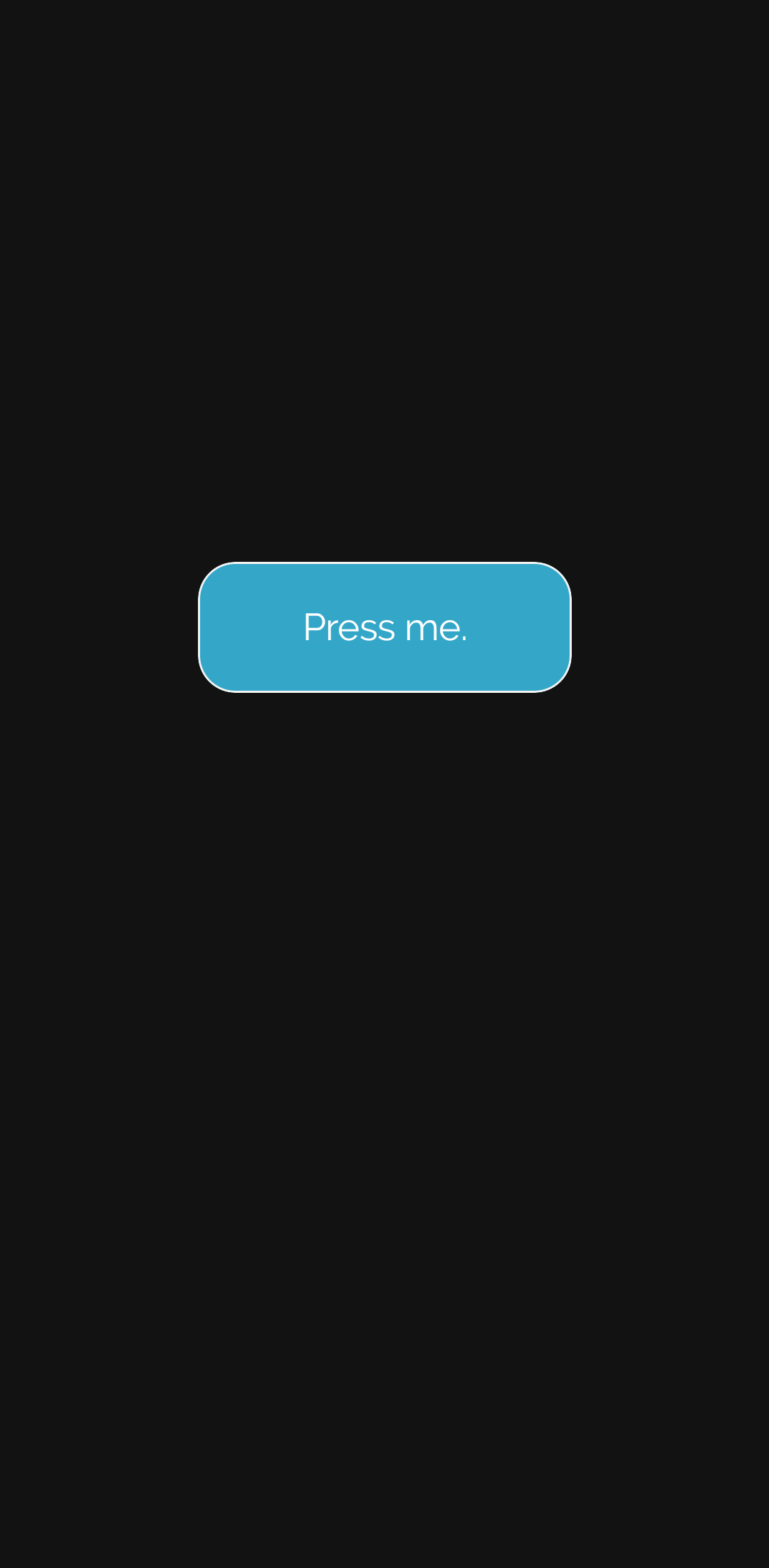
The button after adding the text layer to the container layer.
{
  "type": "container",
  "name": "button",
  "classes":[
    "buttonContainer"
  ],
  "children": [
    ...
  ],
  "actions": [
    {
      "type": "showMessage",
      "params": {
        "title": "$lang(messageTitle)$",
        "text": "$lang(messageText)$"
      }
    }
  ]
}
- Add an
actionsarray to thecontainerlayer. - Add the action that you want to be executed when tapping the button.

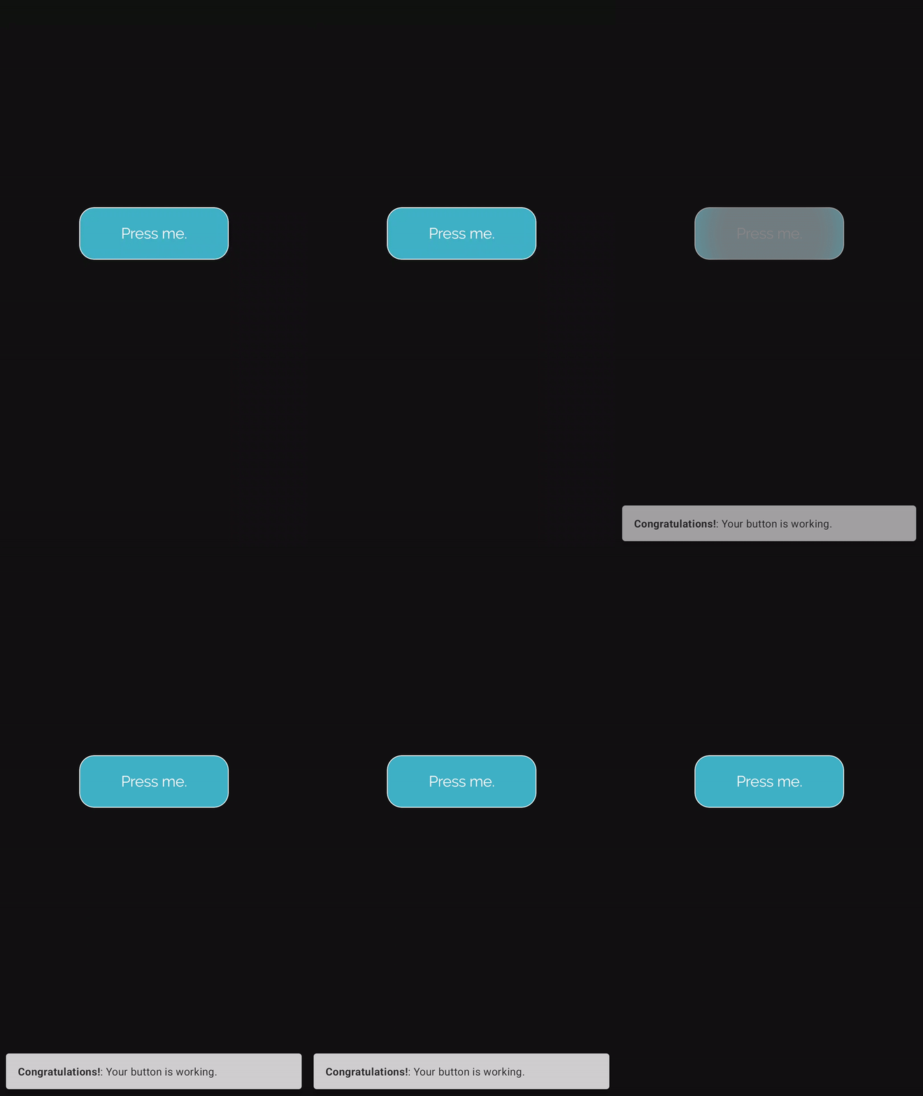
The button after the action has been added to the container layer.
A button has been created.
Copyable code
{
  "type": "container",
  "name": "button",
  "classes":[
    "buttonContainer"
  ],
  "children": [
    {
      "type": "color",
      "classes": [
        "buttonColor",
        "fullSize"
      ]
    },
    {
      "type": "text",
      "value": "$lang(buttonText)$",
      "classes": [
        "buttonText",
        "fullSize"
      ]
    }
  ],
  "actions": [
    {
      "type": "showMessage",
      "params": {
        "title": "$lang(messageTitle)$",
        "text": "$lang(messageText)$"
      }
    }
  ]
}
{
  "name": ".buttonContainer",
  "content": {
    "borderColor": "#f3f3f3",
    "borderWidth": "1pt",
    "borderRadius": "20pt",
    "constraints": [
      {
        "type": "pos",
        "anchor": "c",
        "x": "50%",
        "y": "40%"
      },
      {
        "type": "size",
        "width": "200pt",
        "height": "70pt"
      }
    ]
  }
}
{
  "name": ".buttonColor",
  "content": {
    "value": "#34a7c9"
  }
}
{
  "name": ".buttonText",
  "content": {
    "scaleType": "alignCenter"
  }
}
{
  "name": "default",
  "content": {
    "buttonText": "Press me.",
    "messageTitle": "Congratulations!",
    "messageText": "Your button is working."
  }
}